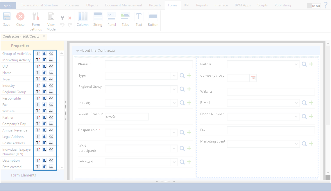
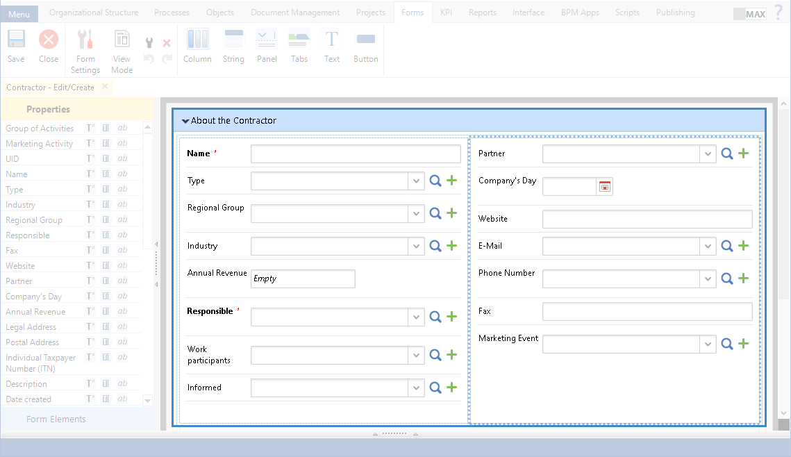
Object properties are in the Properties unit of the left panel on the Forms tab (fig. 1).
|
|
|
Fig. 1. "Forms" tab. Left panel. "Properties" unit
|
By default, you can add object properties only inside one of the main elements: tab, panel, column (fig. 2). When you add an object property to an empty form, a Column element is created.
|
|
|
Fig. 2. "Forms" tab. Object properties
|
To open the dialog box for configuring an object property:
-
double click the required property;
-
click Settings in the context menu of the property;
-
click  in the toolbar.
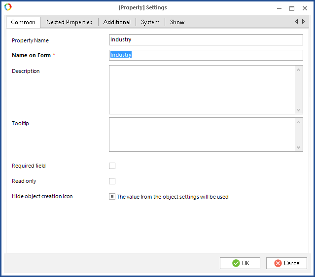
The dialog box for configuring an object property (fig. 3) includes several tabs: Common, Nested Properties, Additional, System, Show, Block Properties. The Block Properties tab is displayed only for the Block type properties; the Nested Properties tab is displayed only for user objects.
|
|
|
Fig. 3. Dialog box for configuring an object property. "Common" tab
|
"Common" tab
An example of this tab is in fig. 3.
Name on Form * – the field name, displayed on the form. By default, this name is the same as the Property Name, but you can change it. This field is required.
Description – property description, displayed on the form. By default, this description is the same as the description on the object property page, but you can change it, if necessary.
Required field – if this box is checked, the field will be required.
Read only – if this box is checked, the object editing form in Web Application will only display the entered values. You will not be able to fill in the fields.
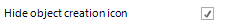
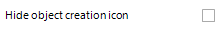
Hide object creation icon – this box can have three positions.
|
Hide
|
The object creation button will be hidden on the form in Web Application. To select this option click on the box once.
|
|
|
Do not hide
|
The object creation button will be displayed on the form in Web Application.
|
|
|
Use parent object value
|
The display of the object creation button will depend on the parent object form settings.
|
|
This box is displayed only if the Hide empty properties box is checked on the Additional tab of the form settings.
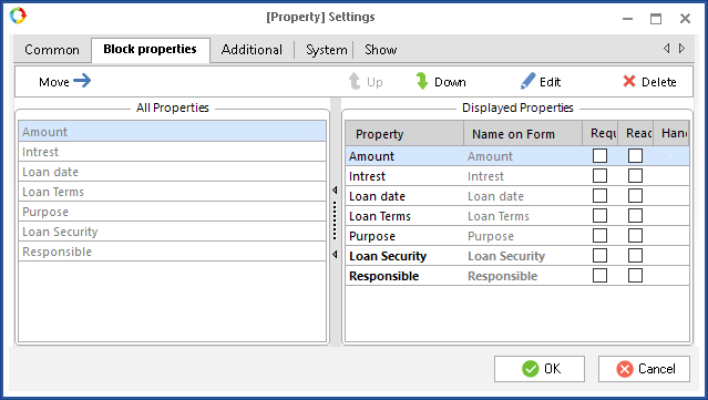
"Block Properties" tab
This tab is displayed only when configuring a
Block type property. This tab is almost identical to the
Form (context) tab of a
Task activity. The only difference is that this tab does not have an
Add button, i.e. you cannot add properties to the block on this tab. An example is shown in fig. 4.
|
|
|
Fig. 4. Dialog box for configuring an object property. "Block properties" tab
|
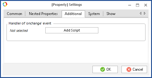
"Additional" tab
By default, this tab (fig. 5) displays the add script button. The script will be executed, when you change the field value. This tab is available only for user objects.
|
|
|
Fig. 5. Dialog box for configuring an object property. "Additional" tab
|
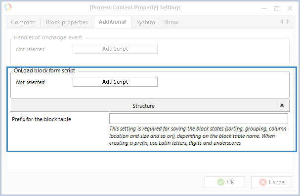
If you are configuring a Block type property, this tab will feature two additional parameters (fig. 6).
Fig. 6. Block type context variable settings. Additional tab
OnLoad block form script – a script that will be executed when loading the block form.
Prefix for the block table – this parameter is required for saving configured block settings. If you need to use these settings on another process task form, you need to specify the same prefix. In the prefix, you can use only Latin letters, digits and underscores.
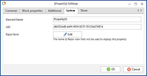
"System" tab
The System tab is in fig. 7.
|
|
|
Fig. 7. Dialog box for configuring an object property. "System" tab
|
Element Name – unique name of the element, used in scripts. You can change this name.
UID – UID of the element, automatically generated, when you are creating it.
Razor form – path to the form file in the Razor markup language.
|
Attention!
To apply changes and display them in Web Application, save the form and publish the object.
|
The form can display the following parameters: name, value and property description. In ELMA Designer, each property has several parameters:
-
-
property value – display the property value, specified in Web Application. This parameter has the  icon in the Properties unit.
-
You can also configure object properties display parameters.
Object property parameters are in the Properties unit, to the right of each property (fig. 8). By default, you can add object property parameters to an empty form and to elements.
|
|
|
Fig. 8. "Form" tab. "Properties" unit. Property parameters
|
|
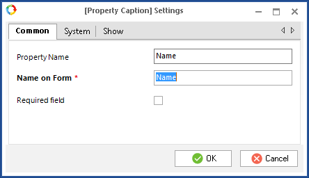
Property Caption
|
Fig. 9 illustrates the Common tab of the Property Name parameter.
|
|
|
Fig. 9. Dialog box for configuring the "Property Name" parameter. "Common" tab
| Property Name – object property name, same as the one, displayed on the object page. You cannot change this value.
Name on Form * – field name, displayed on the form. By default, it is the same as the Property Name, but you can change it, if necessary. This field is required.
Required field – if this box is checked, this field will be required.
|
|
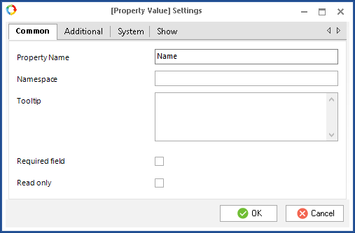
Property Value
|
Fig. 10 illustrates the Common tab of the Property Value parameter.
|
|
|
Fig. 10. Dialog box for configuring the "Property Value" parameter. "Common" tab
| Property Name – object property name, same as the one, displayed on the object page. You cannot change this value.
Tooltip – a text field for entering a tooltip that will be displayed on the form when hovering your mouse pointer over the field.
Required field – if this box is checked, this field will be required.
Read only – if this box is checked, the object editing form in Web Application will only display the entered values. You will not be able to fill in the fields. We recommend selecting this option only for the view form.
For Text and String types, the additional Namespace field is displayed on the Common tab. In this field, you can enter a text that will be displayed in grey on the form in this text/string field.
|
|
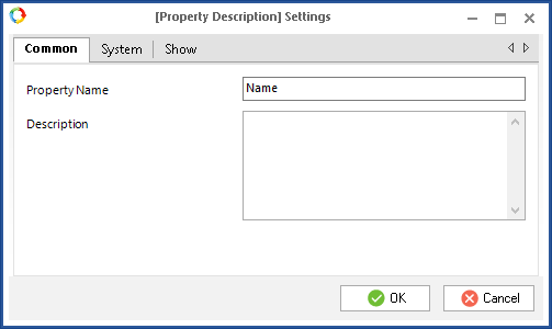
Property Description
|
Fig. 11 illustrates the Common tab of the Property Description parameter.
|
|
|
Fig. 11. Dialog box for configuring the "Property Description" parameter. "Common" tab
| Property Name – object property name, same as the one, displayed on the object page. You cannot change this value.
Description – property description, displayed on the form. By default, it is the same as the description on the object property page, but you can change it, if necessary.
|
This tab is displayed only for the property value settings.
This tab is displayed for all the property parameters settings.
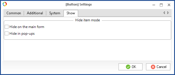
Show tab
This tab is available in the settings window of all the form elements (fig. 12).
Fig. 12. Button settings window. Show tab
The tab contains the settings of the element display in the web interface.
Hide on the main form – if this box is checked, the element will not be available on the main form, which you are editing at the moment.
Hide in pop-ups – if this box is checked, the element will be hidden in case the form is intended for a pop-up window.
Properties display in Web Application
Fig. 13 and 14 illustrate examples of the object editing form display in ELMA Designer and Web Application.
|
|
|
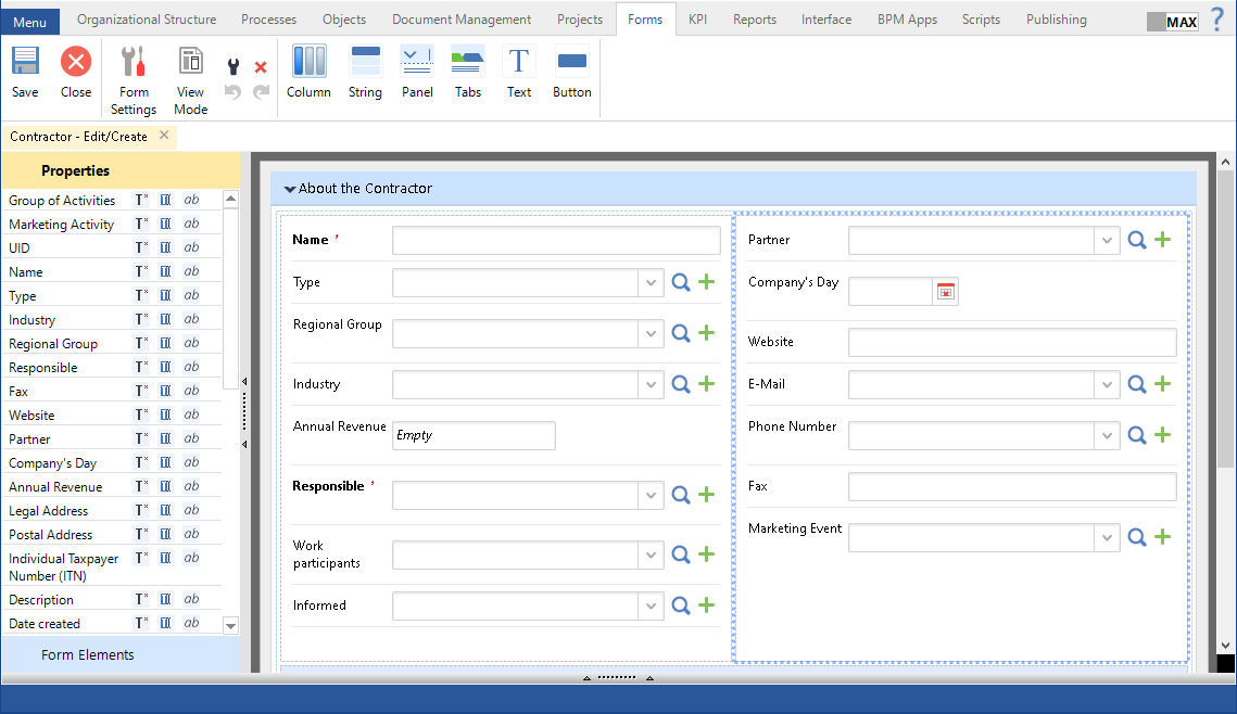
Fig. 13. Object editing form in ELMA Designer
|
|
|
|
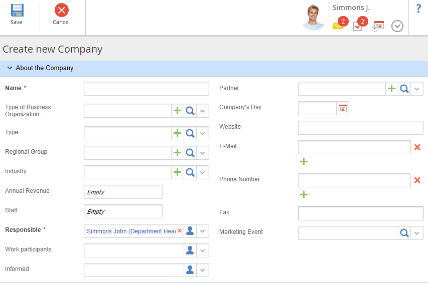
Fig. 14. Object editing form in Web Application
|
Copyright © 2006–2019 ELMA

 icon in the
  icon in the