How to Work with Classic Diagrams
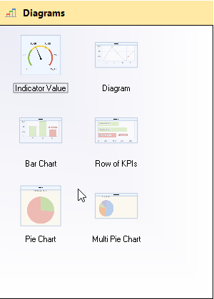
In the Diagrams unit, you can find such elements as Diagram, Bar Chart, etc (fig. 1) which are used to clearly display the values of one or several KPIs.
Fig. 1. Toolbox. Diagrams unit
KPI value
This element displays the value of one chosen
KPI for the current period. The color of the element when displayed in the web application corresponds to the colors of the
scale set for this KPI (fig. 2). Please note that this element cannot be used for
personal KPIs and
goals.
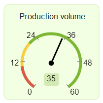
In fig. 2 you can see an example of how this element is displayed in the web application.
Fig. 2. Indicator value element in the web application
Bind this element with a KPI model object so that the information is displayed correctly in the web application. To find out more about binding diagram elements with KPI model objects, read the
respective Help page.
Diagram
This element displays the values of one or several
KPIs for a certain number of periods in the form of a diagram.
Please note that using this element is pointless for personal KPIs.
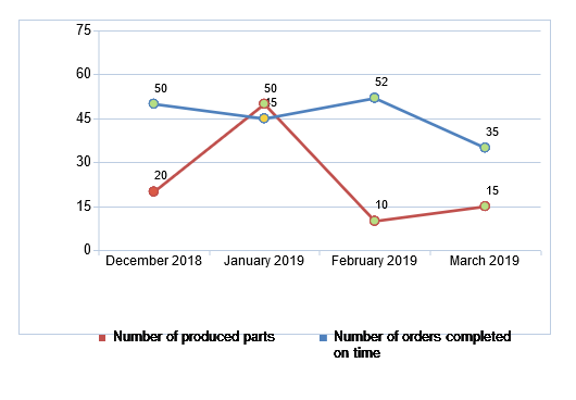
You can see an example of how this element is displayed in the web application in fig. 3.
Fig. 3. Diagram element in the web application
This element must be
configured to be displayed correctly in the web application.
Bar Chart
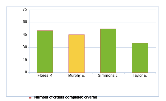
This element can be used to compare the values of
KPIs (fig. 4) for different periods. Please note that
personal KPI values are compared within 1 period according to the
chosen settings (fig. 5).
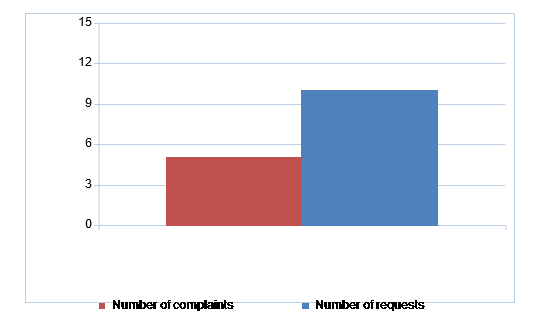
In fig. 4 and 5 you can see how this element is displayed in the web application.
Fig. 4. Bar chart element in the web application
Fig. 5. Bar chart element for personal KPIs in the web application
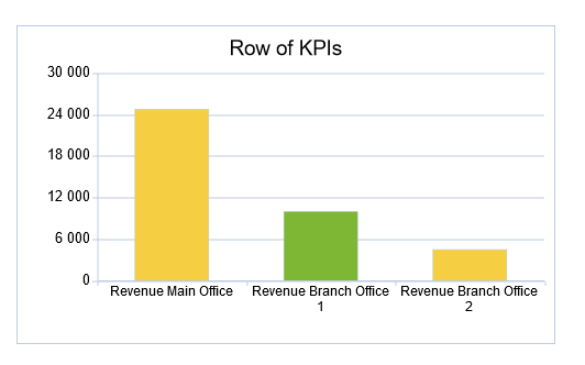
Row of KPIs
This element can be used to display the values of
KPIs (fig. 4) for the current period. In fig. 6 you can see how this element is displayed in the web application.
Fig. 6. Row of KPIs element in the web application
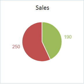
Pie Chart
This element in the form of a pie chart displays the values of one personal indicator of different users in the current period. Fig. 7 shows the element in the the web application.
Fig. 7. Pie Chart element in the web application
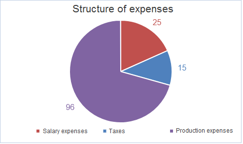
Multi Pie Chart
This element in the form of a pie chart displays a total’s share of each selected indicator for the period. Please note that using this element is not available for personal KPIs.
In fig. 8 you can see an example of how this element is displayed in the web application.
Fig. 8 Multi Pie Сhart element in the web application
Copyright © 2006–2019 ELMA

