You can add other elements (tabs, panels, text and so on) and/or properties to the Panel element. You can add a panel to an empty form, column, tab or another panel (fig. 1). To learn more about adding this element to the form, see the respective Help section.
Fig. 1. "Forms" tab. "Column" Element
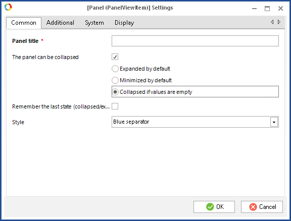
You can configure each of the panels. The dialog box for configuring the Panel element includes several tabs: Common, Additional, System and Show (fig. 2).
Fig. 2. Dialog box for configuring the "Panel" element. "Common" tab
"Common" tab
An example of this tab is in fig. 2.
Panel title *– name of the panel, displayed in Web Application. This field is required.
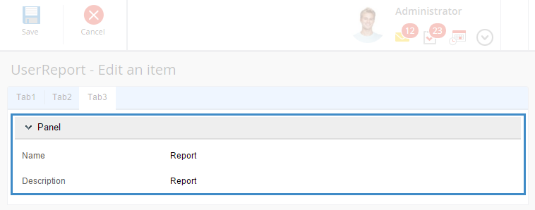
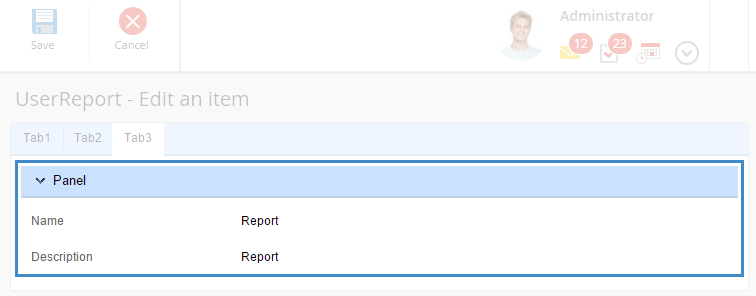
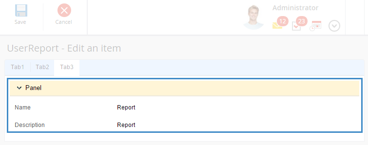
The panel can be collapsed – when you check this box, the panel becomes collapsible (fig. 3), and it gets additional settings:
Expanded by default – the selected panel will be expanded in Web Application.
Minimized by default – the selected panel will be collapsed in Web Application.
Collapsed if values are empty – the selected panel will be collapsed in Web Application if the fields on this panel are not filled.
Fig. 3. Object editing form in the web application. Expanded panel
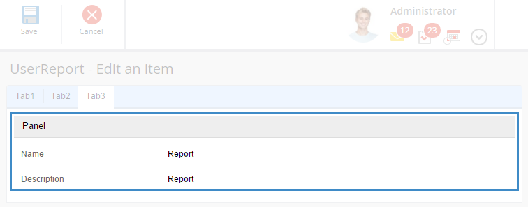
If you do not check the box, you will not be able to collapse or expand the panel in Web Application (fig. 4).
Fig. 4. Object editing form in the web application
Keep collapsed – when this box is checked, the system remembers the last state of the panel, and uses it when you reload the page.
Style – select the panel display style from the drop down list:
No style – the panel is displayed without any style (fig. 5):
Fig. 5. Object editing form in Web Application. "No style"
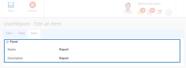
Gray separator – the panel is highlighted with gray (fig. 6):
Fig. 6. Object editing form in Web Application. "Gray separator"
Blue separator – the panel is highlighted with blue (fig. 7):
Fig. 7. Object editing form in Web Application. "Blue separator"
Yellow separator – the panel is highlighted with yellow (fig. 8):
Fig. 8. Object editing form in Web Application. "Yellow separator"
User – create a custom display style. When you select this option, the dialog box displays an additional field - CSS class *- which is required. In this field you have to enter the path to a .css file with styles.
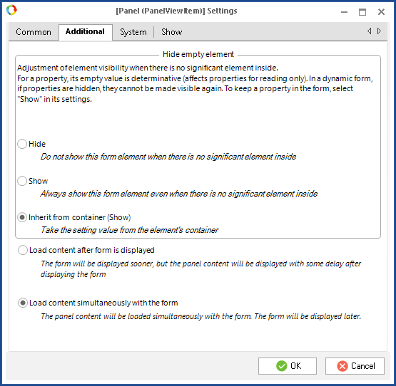
"Additional" tab
By default, this tab (fig. 9) displays several options, which define the order of loading contents in Web Application. The options have descriptions.
Fig. 9. Dialog box for configuring the "Panel" element. "Additional" tab
If you select Hide, this panel will not be displayed on the view form in Web Application, if all the form fields are empty. If at least one field is filled in, it will be displayed on the view form in Web Application, while the other fields on the panel will be hidden.
By default, these settings are inherited from the form settings. If necessary, you can select different settings for this element.
"System" tab
This tab is similar to the System tab in the dialog box for configuring an object property.
"Show" tab
This tab is displayed in the settings dialog box of all the elements and is similar to the tab, described in the general object property settings.