You can
place the
Button element both inside different form elements (
tabs,
panels,
text, etc.) and on an empty panel. You cannot place other elements and properties inside the
Button element. To learn more about placing elements on the form, see the
respective Help section.
A Button can contain a text or an icon and have various appearance styles. When you add several buttons and/or static texts to a column in the Designer, they are displayed in a column in Web Application; when you add buttons to other form elements (panel, tab, string), they are displayed in a row.
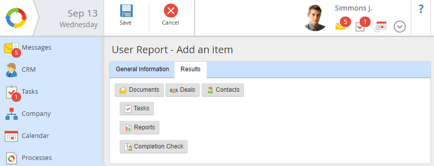
Fig. 1. Display of buttons in Web Application
When clicking a button:
-
a script can be executed;
-
-
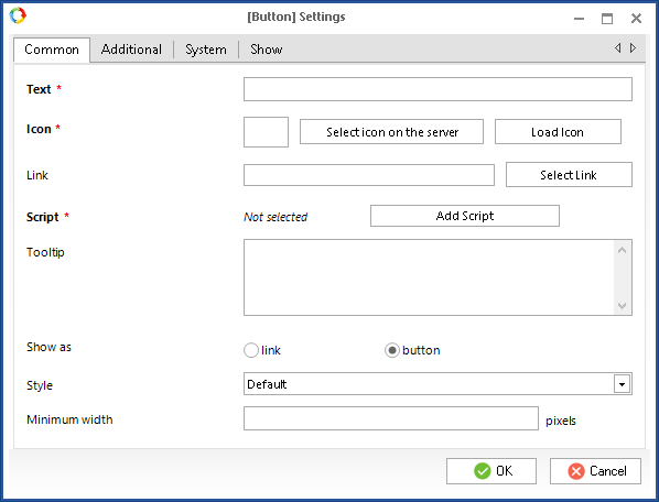
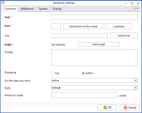
When you add a Button to a form, its settings dialog box opens automatically (fig. 2):
Fig. 2. Dialog box for configuring the Button element. Common tab
This dialog box consists of four tabs – Common, Additional, System and Show.
Common tab
This tab is shown in fig. 2.
The Common tab includes the following fields:
Text * – name of the button that will be displayed on the form in Web Application. This field is required only if
script is selected as the button action.
Icon * – add an icon that will be displayed on the form next to the button name (if there is one). You can add an icon both from ELMA server and from your computer. To select an icon, click
Select icon on the server or
Load Icon. This field is required only if
script is selected as the button action. By default, when adding a form, the

icon is displayed
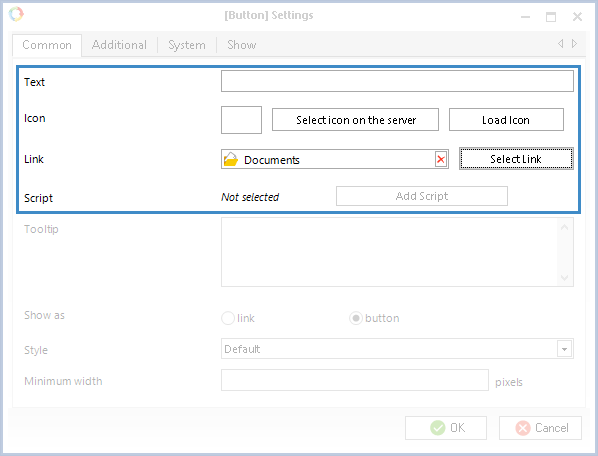
Link – select the required action from the ELMA action registry or an object form. To select an action or a form, click Select Link and chose an element in the opened dialog box.
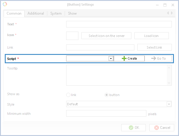
Script * – select a
script. Click
Add Script. The field will change (fig. 3). In the drop down list you can select an existing script, or
create a new one using the
Create button. This field is required only if the
Link field is empty.
Fig. 3. Dialog box for configuring the Button element. Script field
You cannot specify both a link and a script in the button settings. If you select a link, you will not be able to select a script and vice versa (fig. 4).
Fig. 4. Dialog box for configuring the Button element
To create a button with a script, you also need to fill in the Text and Icon fields. For buttons with a link or a form, these fields are not required, since a link already contains a name and an icon (fig. 5) and for a form the "Open Form" text and the standard button
are added.
Tooltip — the text, that will be displayed when you mouse over the button.
Show as – this parameter defines how the button will be displayed:
-
link – the element will be displayed as a link (fig. 9);
-
button – the element will be displayed as a button (fig. 8). If you select this option, you can configure the style and the minimum width of the button (fig. 2).
On the read only form (fig. 5) – this parameter defines if this button can be displayed on the
Read only form (including after completing a
process task).
|
Attention!
This feature is available only in ELMA 3.13.2 and higher.
|
-
Active – the button will appear on the form and the user will be able to click the button to complete an action;
-
Inactive – the button will be displayed on the form, but will remain inactive meaning that the user will not be able to use it;
-
Hidden – the button will be hidden and unavailable to the user.
Fig. 5. Settings of the Button element. “On the read only form” field
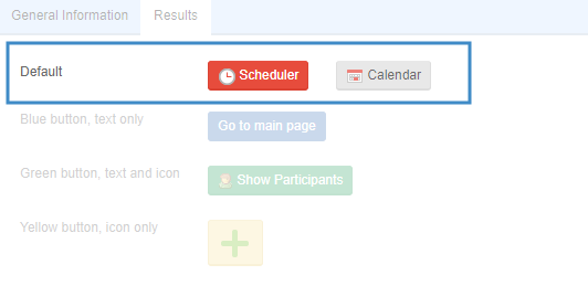
Fig. 6 shows different ways of how a button can be displayed on a form. The Scheduler button is Active, the Calendar button is Inactive, the Folders button is Hidden.
Fig. 6. Button display variants
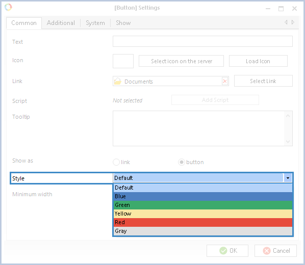
Style – this parameter (fig. 7) allows you to select a color that will be used for the button in Web Application. By default, light-grey is selected (fig. 5, 6). From the drop down list, you can select one of the following colors:
Fig. 7. Button element settings. Style field
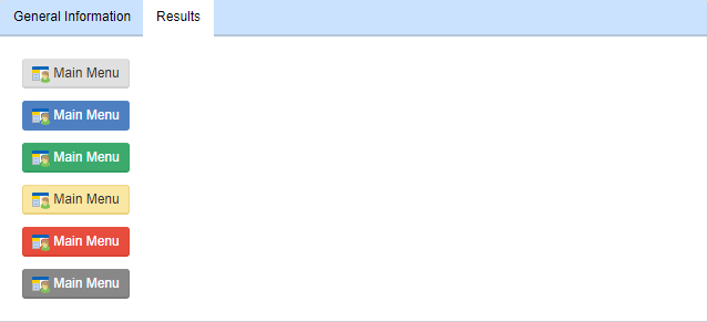
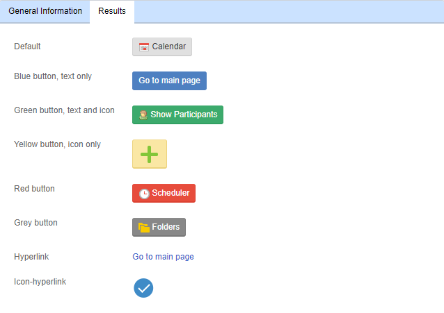
In Web Application, buttons of different colors will look like this (fig. 8):
Fig. 8. Buttons of different colors in Web Application
Minimum width – this parameter allows specifying the minimum width of the button in Web Application (in pixels). The minimum possible width is 50 pixels.
Possible options of buttons display in Web Application are shown in fig. 9.
Fig. 9. Various styles of the Button element in Web Application
Additional and System tabs
These tabs are the same as for the
Column element.
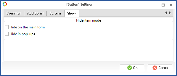
Show tab
This tab contains settings of the button display in the web interface (fig. 10).
Hide on the main form – if this box is checked, the button will not be available on the main form, which you are editing at the moment.
Hide in pop-ups – if this box is checked, the button will be hidden in case the form is intended for a pop-up window.
Fig. 10. Button settings window. Show tab
Copyright © 2006–2019 ELMA